Creating Word Clouds in Google Data Studio
A while back Google Data Studio launched Community visualisations. This allows us to create all the charts that we always wished Data Studio would have but they were too busy offering us a free, amazing data visualisation platform.
There are already some great visualisations on offer, such as:
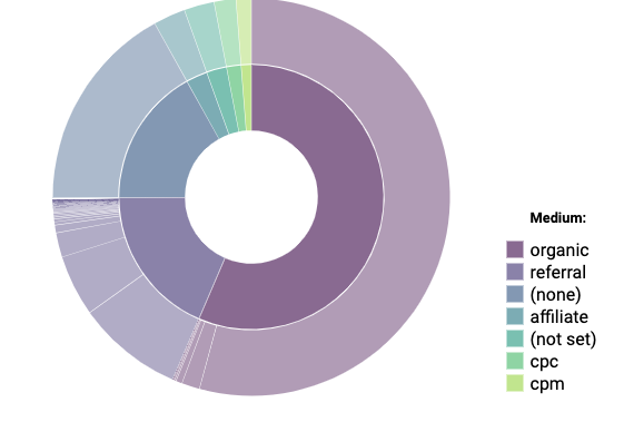
Starburst (which may go again visualisation principles but impresses my boss).
Data from Google Merchandise Store
Funnels
Data from Google Merchandise Store
And improved filtering
Though with all this I really wanted a word cloud to show off search terms on site or popular product types. I may have pure analysts say it is better in a bar chart, but for presentations it is nice to mix it up a bit. So I built my own, which you can use.
Step 1: Set up your Data Studio report
Go to https://datastudio.google.com/ and create a new report (https://support.google.com/datastudio/answer/6291026?hl=en) .
Step 2: Add your data source to your report
Select which data source you would like to add and follow the prompts - more instructions here: https://support.google.com/datastudio/answer/6300774?hl=en
When adding the data source make sure that Community Visualisation Access is turned to on:
Step 3: Add the community visualisation
Next to the “Add a chart” button there is a button with lots of different shapes. Click on this and it will give you some examples of community visualizations, we want to + Explore more.
Have a look around at the different options on offer, maybe think of a different way you can tell your data story.
To add the word cloud click on Build your own visualization
Under the Manifest Path enter:
gs://meliorum-visualisations/wordcloud/Click Submit and you will have the option to add the Simple Word Cloud.
Still very much in development mode, so if there is any issues please let me know.
Step 4: Play around
Go nuts creating word clouds. One example is to get the search query that brought people to your site. This word cloud, splits individual words so you can see trends.
You can adjust the colour under the style tab.
Get in touch if you have suggestions on how it can be improved, or ideas for other visualisations. If you want to try and create one yourself there is a great tutorial here: https://codelabs.developers.google.com/codelabs/community-visualization/#0
Help maintain and improve the word cloud
At this point, Google doesn't let me know how many people are using this visualisation. Please comment below if you like it and want to see improvements.
If you use this visualisation and want to see improvements made please feel free to donate what you think is appropriate to its ongoing upkeep. Any donation would be greatly appreciated.


